Renaissance Greek with Ligatures (or, for short, RGreekL2) is a font that will allow anyone easily to write Greek in the style of the Renaissance. For example, an editor of Greek texts may use it to reproduce a ligatured word in the manuscript that could be interpreted in different ways. Since the first printers adopted this style of writing for their type, the font can also be used to represent, say, an incunabulum. Many ligatures and abbreviations remained in use up until the eighteenth century.
To give an example, here is the opening of Apollonius’ Syntax:
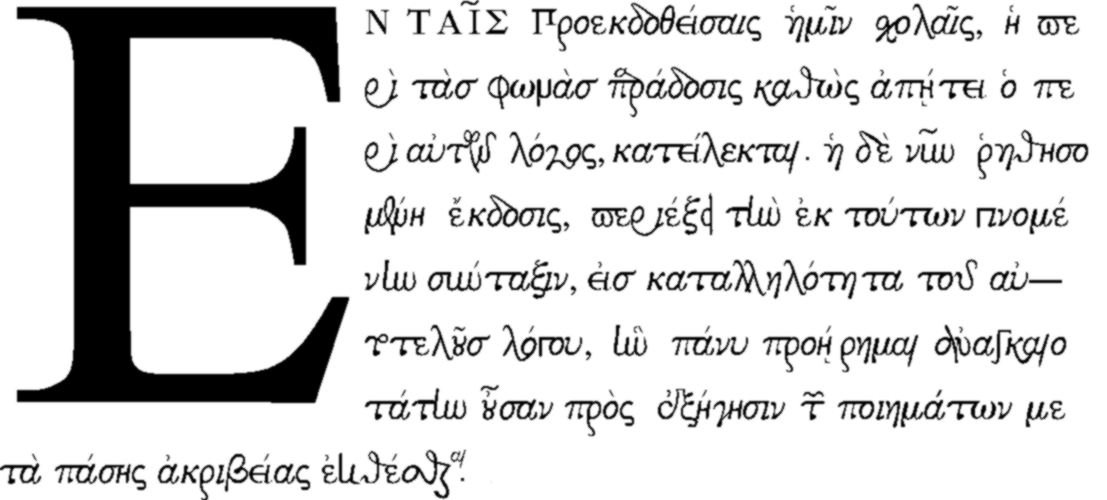
Ἐν ταῖς προεκδοθείσαις ἡμῖν σχολαῖς ἡ περὶ
τὰς φωνὰς παράδοσις, καθὼς ἀπῄτει ὁ περὶ
αὐτῶν λόγος, κατείλεκται· ἡ δὲ νῦν ῥηθησομένη
ἔκδοσις περιέξει τὴν ἐκ τούτων γινομένην
σύνταξιν εἰς καταλληλότητα τοῦ αὐτοτελοῦς
λόγου, ἣν πάνυ προῄρημαι, ἀναγκαιοτάτην
οὖσαν πρὸς ἐξήγησιν τῶν ποιημάτων, μετὰ
πάσης ἀκριβείας ἐκθέσθαι.
And here is the same passage set in RGreekL2 (click to zoom):
With the above compare the corresponding page in Aldus Manutius’ editio princeps of 1495. (You may also download the entire volume.)
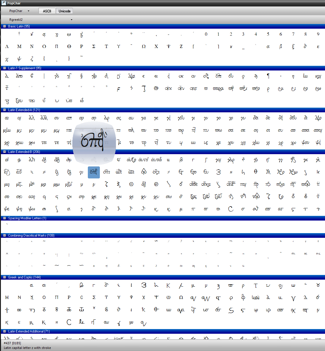
To input a character, simply select RGreekL2 from the Font Menu, and start to write—there is no need to change the keyboard, since RGreekL2 is not (yet) a Unicode font. To input diacritics or a ligature, one can choose Insert » Symbol or sim., or use a utility such as PopChar X or PopChar Win (see screenshot).
The Basic Latin section (as shown in the Charts) includes the Greek alphabet as well as the ligatures for καί, ου, and οῦ; the Latin Supplement section contains alternative letter forms, prepositional prefixes, and diacritics; the Latin Extended A section is used for combinations of two or three letters; and the Latin Extended B section contains variants to the characters given in Latin Extended A as well as a number of characters from earlier minuscule forms, entire words, and combining characters. In all, the font consists of almost a thousand glyphs. It is not yet complete, though—early printers had often at least five hundred sorts in their boxes, and some had many more.
Please get in touch or leave a comment if you believe an important ligature is missing, or have some other suggestion. And of course if you have used the typeface with success, a comment (with link) would be most welcome, so that others may see what the results look like.
□
 Vernon Eugene Kooy, Ph.D. (Claremont Graduate University) |
This work is licensed under a Creative Commons Attribution-Noncommercial-Share Alike 3.0 US License.